%22%20fill%3D%22%23498AC7%22%2F%3E%0A%3Cg%20clip-path%3D%22url(%23clip0_14993_5160)%22%3E%0A%3Cpath%20d%3D%22M426.51%20180.638L412.599%20179.279L417.745%20126.608L431.274%20127.93L426.51%20180.638Z%22%20fill%3D%22white%22%2F%3E%0A%3Cpath%20d%3D%22M473.93%20185.447L460.019%20184.088L465.301%20130.026L478.829%20131.347L473.93%20185.447Z%22%20fill%3D%22white%22%2F%3E%0A%3Cpath%20d%3D%22M493.649%20187.373L479.721%20186.012L485.002%20131.95L498.531%20133.272L493.649%20187.373Z%22%20fill%3D%22white%22%2F%3E%0A%3Cpath%20d%3D%22M431.901%20146.126L447.142%20128.48L462.705%20130L442.263%20155.599L455.974%20184.166L438.776%20182.486L430.265%20162.871L431.901%20146.126Z%22%20fill%3D%22white%22%2F%3E%0A%3Cpath%20d%3D%22M539.689%20154.918C539.689%20154.918%20539.708%20154.727%20539.716%20154.64C539.84%20152.651%20542.627%20150.904%20545.568%20150.261L546.876%20136.872C537.245%20137.353%20528.138%20143.239%20527.142%20153.429C527.091%20153.951%20527.058%20154.474%20527.061%20154.984C527.224%20157.264%20527.695%20160.172%20528.81%20162.773C529.727%20164.882%20531.07%20166.768%20533.06%20167.963C537.804%20170.797%20541.084%20171.363%20543.491%20171.528L544.827%20159.107C541.508%20158.396%20539.748%20157.013%20539.706%20154.92L539.689%20154.918Z%22%20fill%3D%22white%22%2F%3E%0A%3Cpath%20d%3D%22M551.606%20176.868C551.606%20176.868%20551.587%20177.059%20551.579%20177.146C551.455%20179.135%20548.625%20180.07%20545.683%20180.713L544.375%20194.102C554.007%20193.621%20563.159%20188.529%20564.154%20178.339C564.205%20177.818%20564.239%20177.294%20564.236%20176.785C564.073%20174.504%20563.602%20171.597%20562.487%20168.995C561.569%20166.887%20560.226%20165%20558.236%20163.805C553.492%20160.972%20550.092%20160.376%20547.684%20160.229L546.549%20171.844C549.868%20172.555%20551.547%20174.773%20551.589%20176.866L551.606%20176.868Z%22%20fill%3D%22white%22%2F%3E%0A%3Cpath%20d%3D%22M555.54%20157.45L567.714%20157.358C568.837%20145.864%20560.311%20137.904%20548.834%20136.782L549.982%20136.894L548.697%20150.04C552.925%20150.436%20555.314%20152.39%20555.54%20157.45Z%22%20fill%3D%22white%22%2F%3E%0A%3Cpath%20d%3D%22M537.755%20173.46L525.58%20173.552C524.457%20185.046%20529.801%20192.696%20541.278%20193.817L542.566%20180.636C538.339%20180.241%20537.98%20178.521%20537.755%20173.46Z%22%20fill%3D%22white%22%2F%3E%0A%3Cpath%20d%3D%22M521.49%20180.017C521.434%20180.591%20521.294%20181.121%20521.052%20181.624C520.277%20186.868%20515.596%20189.5%20510.257%20188.978L496.346%20187.619L497.754%20173.204L506.327%20174.041C507.284%20174.135%20508.142%20173.429%20508.236%20172.472L510.288%20151.467C510.382%20150.51%20509.676%20149.651%20508.719%20149.558L500.164%20148.722L501.508%20133.528L515.402%20134.885C520.931%20135.426%20525.154%20139.999%20524.614%20145.528L524.074%20151.058L521.492%20179.999L521.49%20180.017Z%22%20fill%3D%22white%22%2F%3E%0A%3C%2Fg%3E%0A%3Cdefs%3E%0A%3CclipPath%20id%3D%22clip0_14993_5160%22%3E%0A%3Crect%20width%3D%22152.248%22%20height%3D%2257.4818%22%20fill%3D%22white%22%20transform%3D%22translate(418%20124)%20rotate(5.58)%22%2F%3E%0A%3C%2FclipPath%3E%0A%3C%2Fdefs%3E%0A%3C%2Fsvg%3E%0A)
MLS Celebrates 20th Anniversary with New Crest

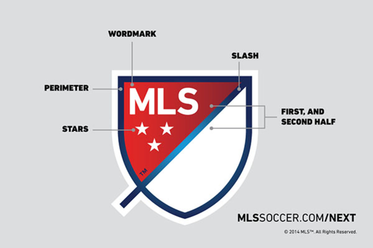
Major League Soccer will celebrate it’s 20th season in 2015, but it’s already getting the party started. Today, MLS unveiled a new league logo as part of its MLS Next campaign. The updated logo is more of a crest in the spirit of other soccer organizations around the world. It’s simpler, cleaner, and way more in line with football fans’ expectations.
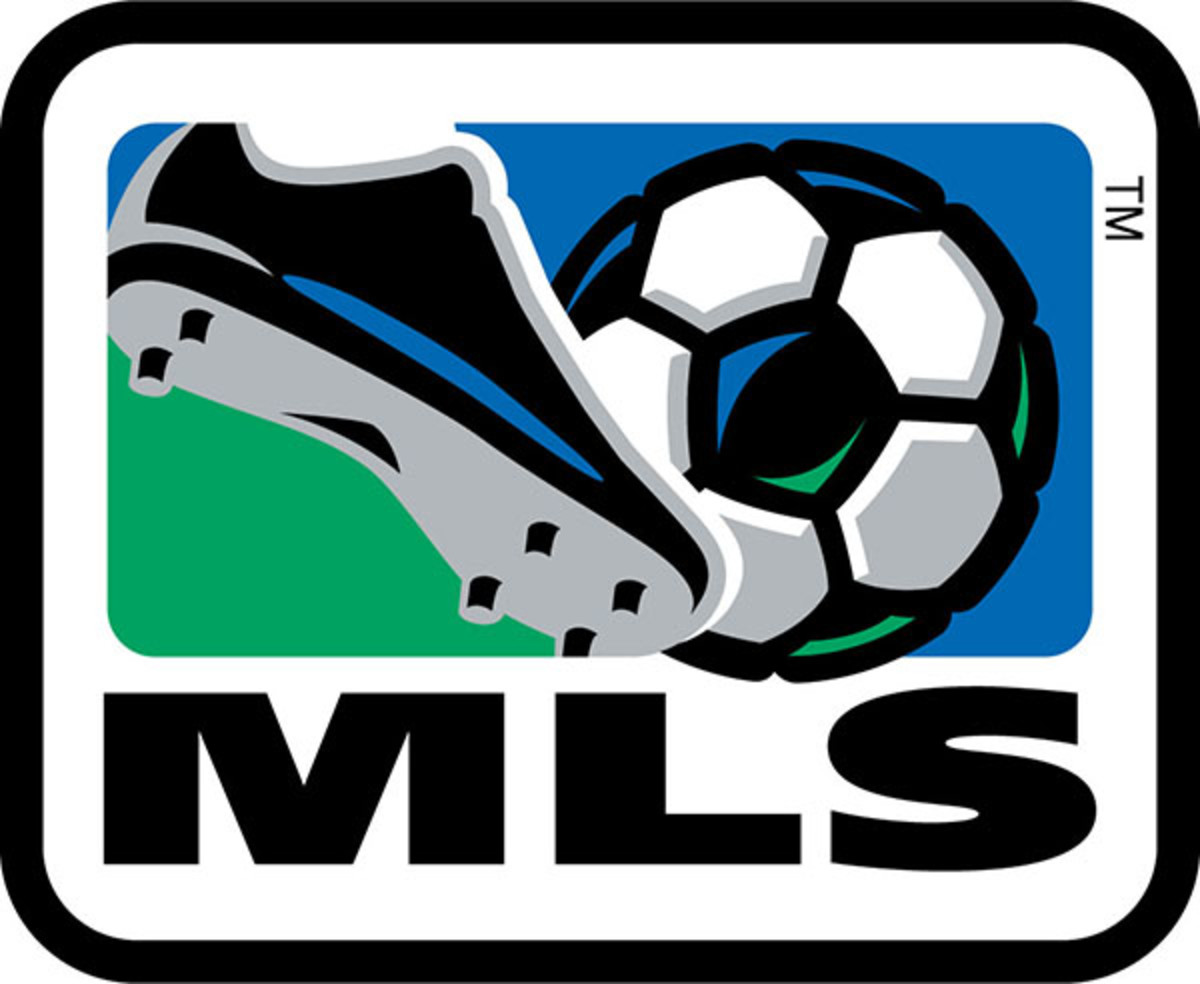
First, here’s the logo MLS has used — in one form or another — since it was founded in 1994:
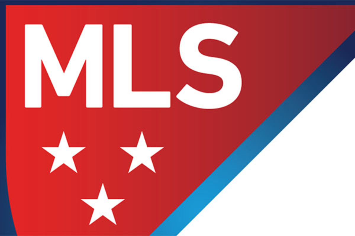
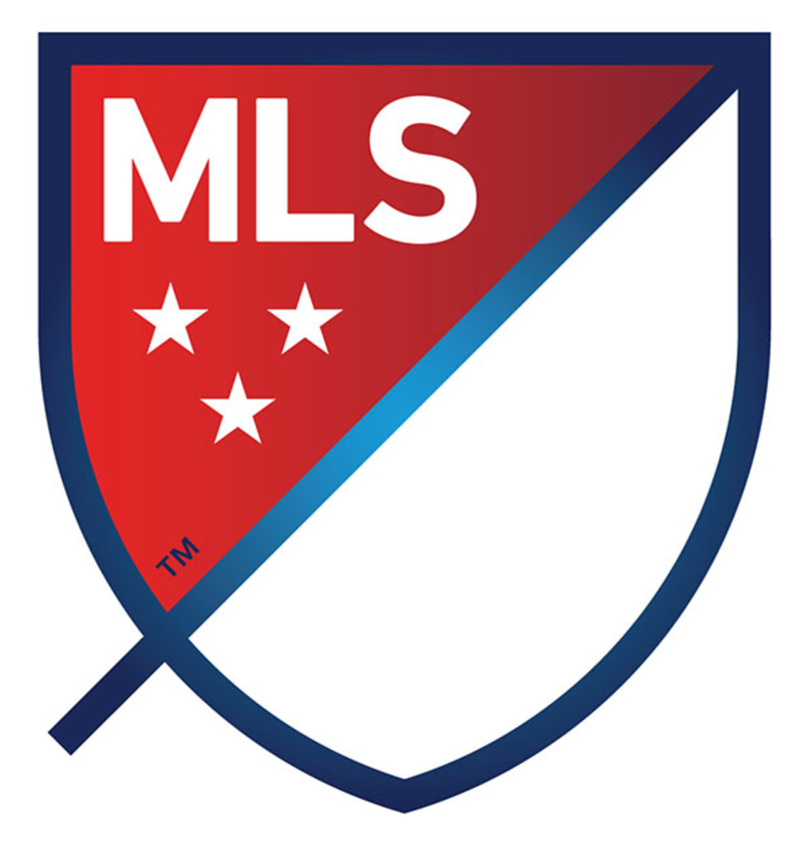
And here’s the league’s new crest:
“The new brand's design is intended to say ‘soccer’ without the literal ball and cleat,” the league says on the MLS Next website. “In the end, we decided that the inclusion of a ball and cleat is unnecessary as it dates us very quickly (due to the fast pace of innovation in our game) while many other ways exist to signal we are a soccer league.”
The logo will also be customizable for each MLS team. This brings a unity to the clubs, but at the same time allowing them to be stand out from one another:
There’s way more information on the new MLS crest at the MLS Next website. Be sure to check it out to learn more about the logo and what it means for the future of the league.
Photos courtesy Major League Soccer